How to style a gallery up a staircase and Cortney and Milo's photos!
There are some gallery designs that are fitting for up the stairs and some that are not.
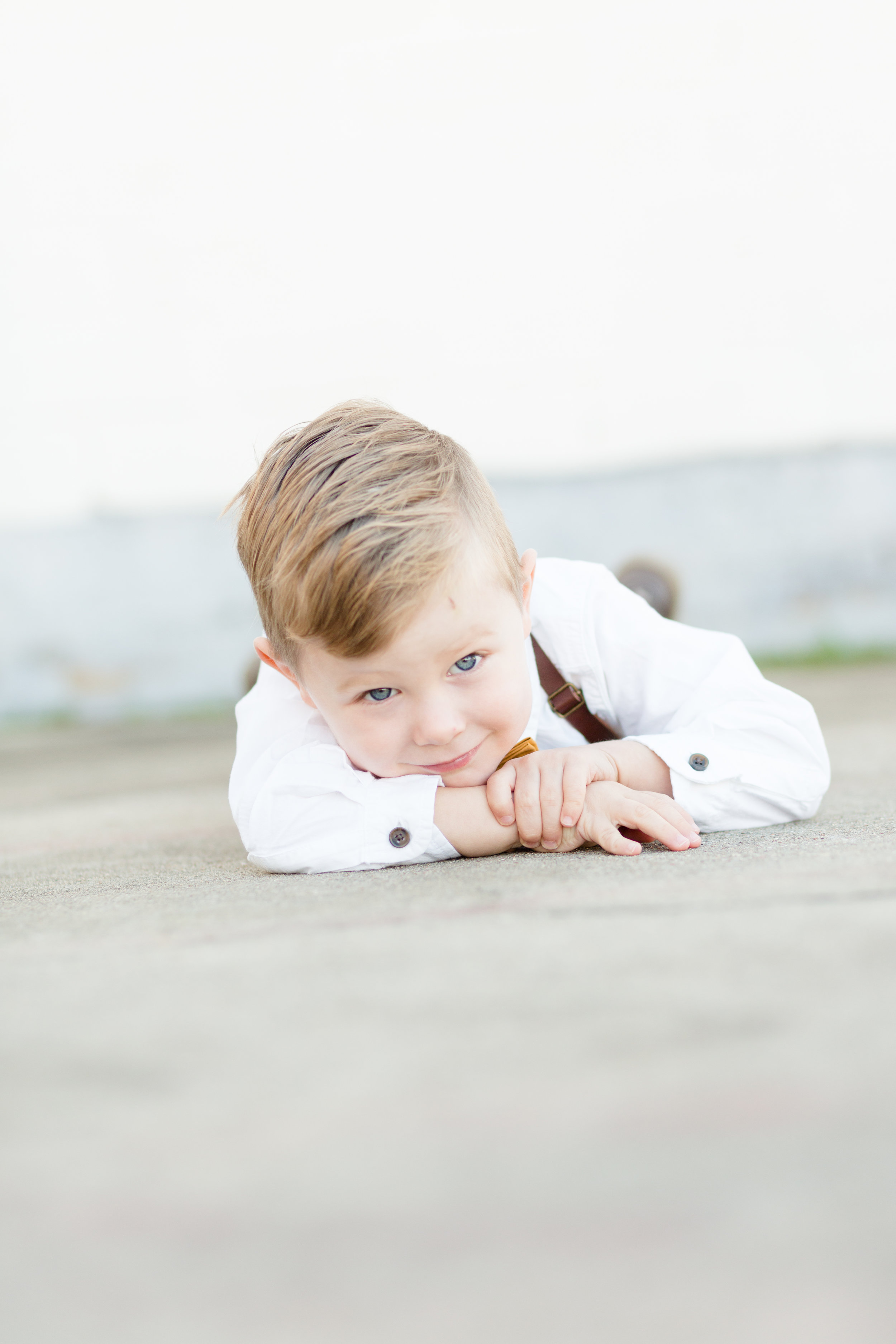
This particular design kind of drives me crazy. Your eye starts with the photo of him laying on the ground then carries up to the right - only to be left for visually wanting to see more or a natural end to the room. It just feels awkward to me.
The staircase is also a great place to start with a wall gallery and then add to it as you get more photos.
This is just looks much better visually. I do think the only thing I’d say is needed is MORE photos! But again this could be a great started gallery!
I think this design below fits better above a couch
It also makes my favorite wall design “shape” a rainbow.
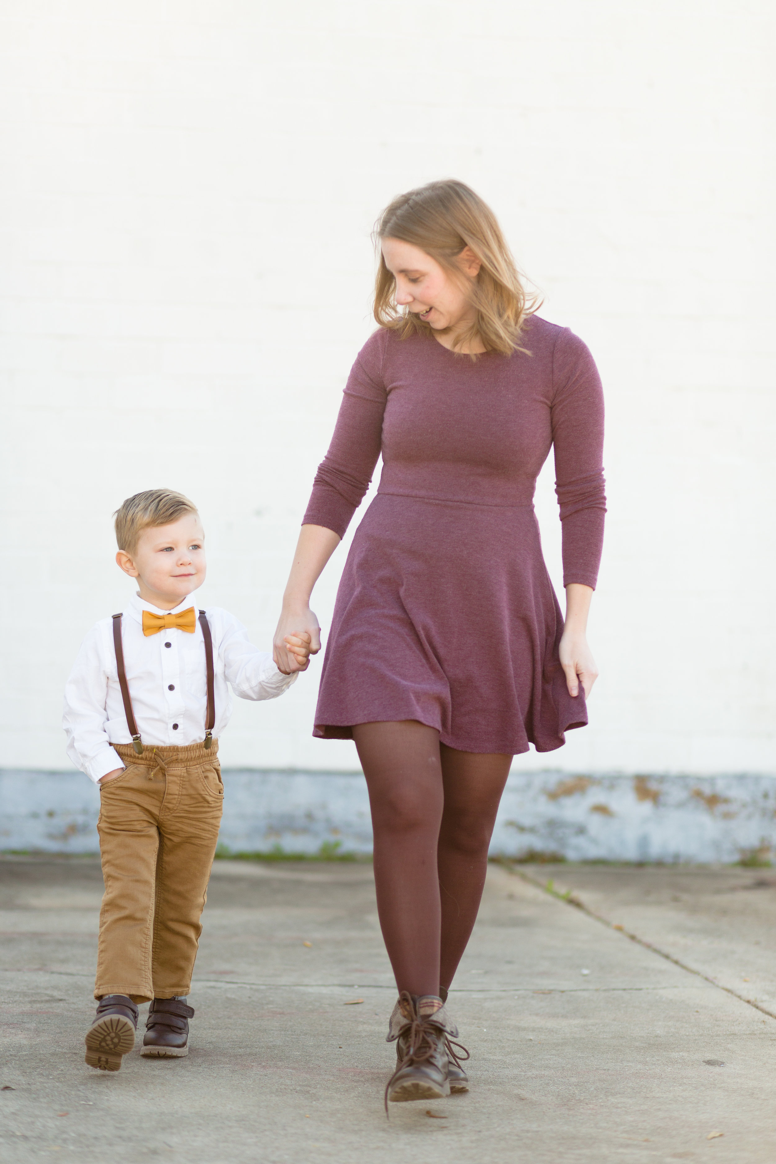
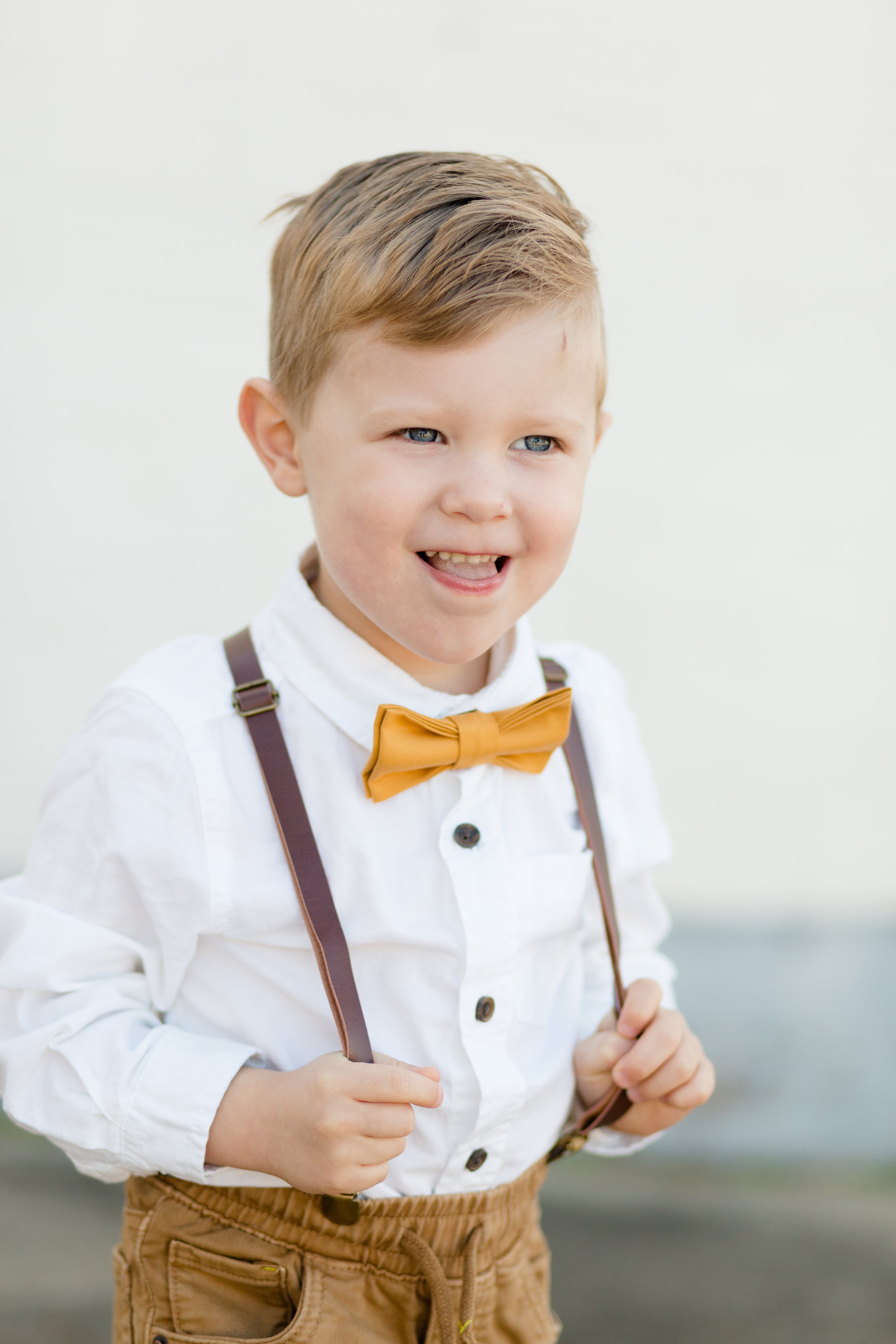
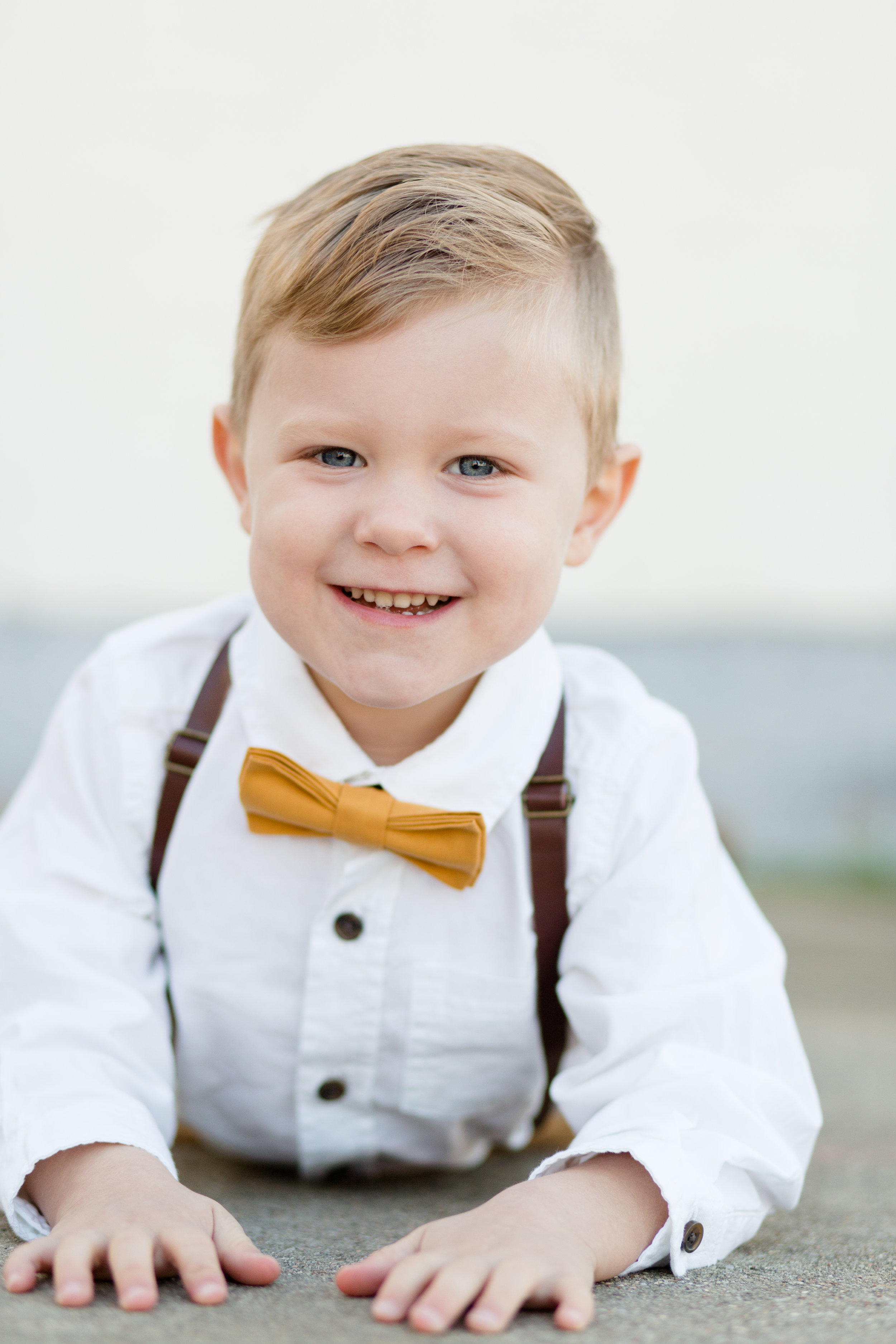
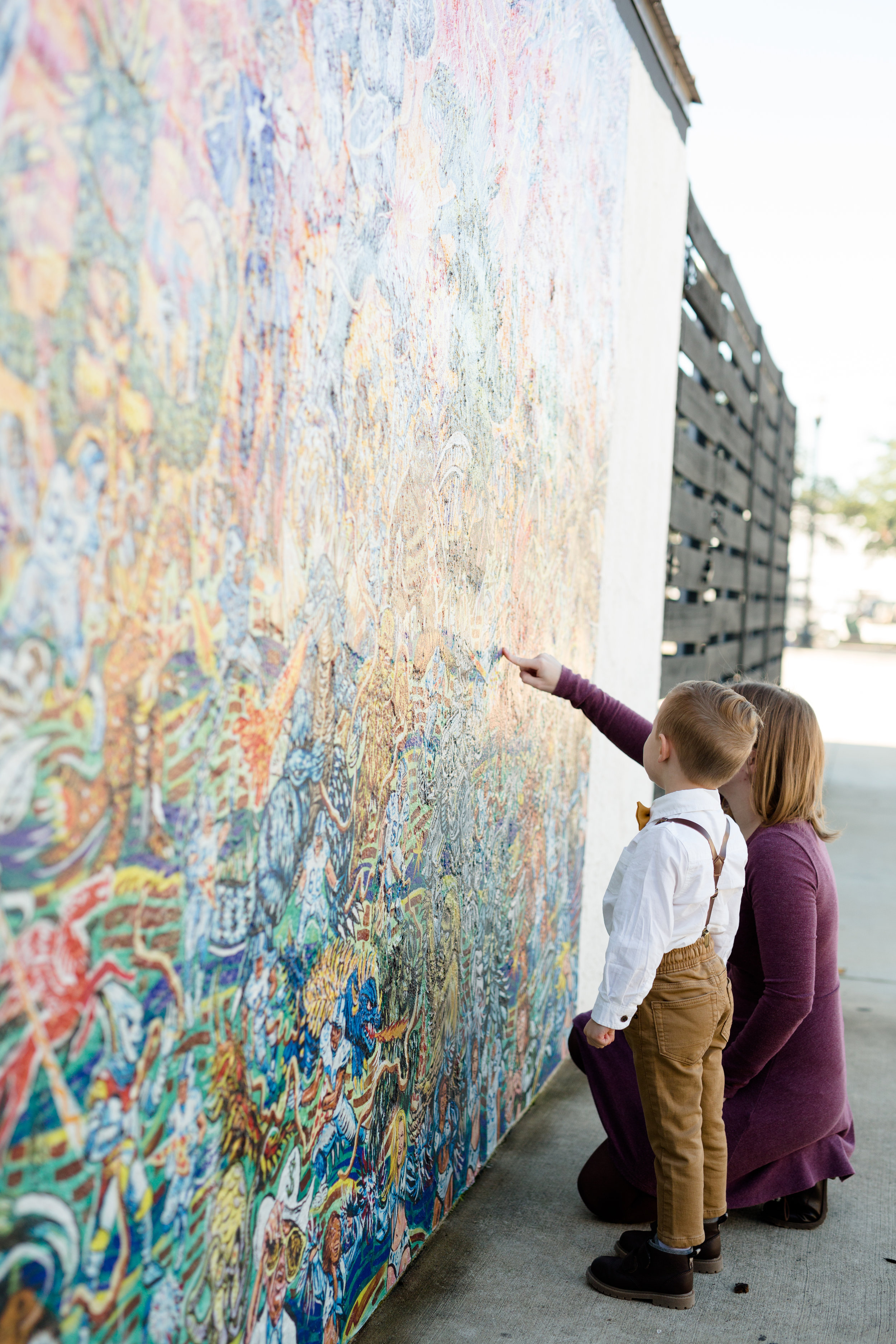
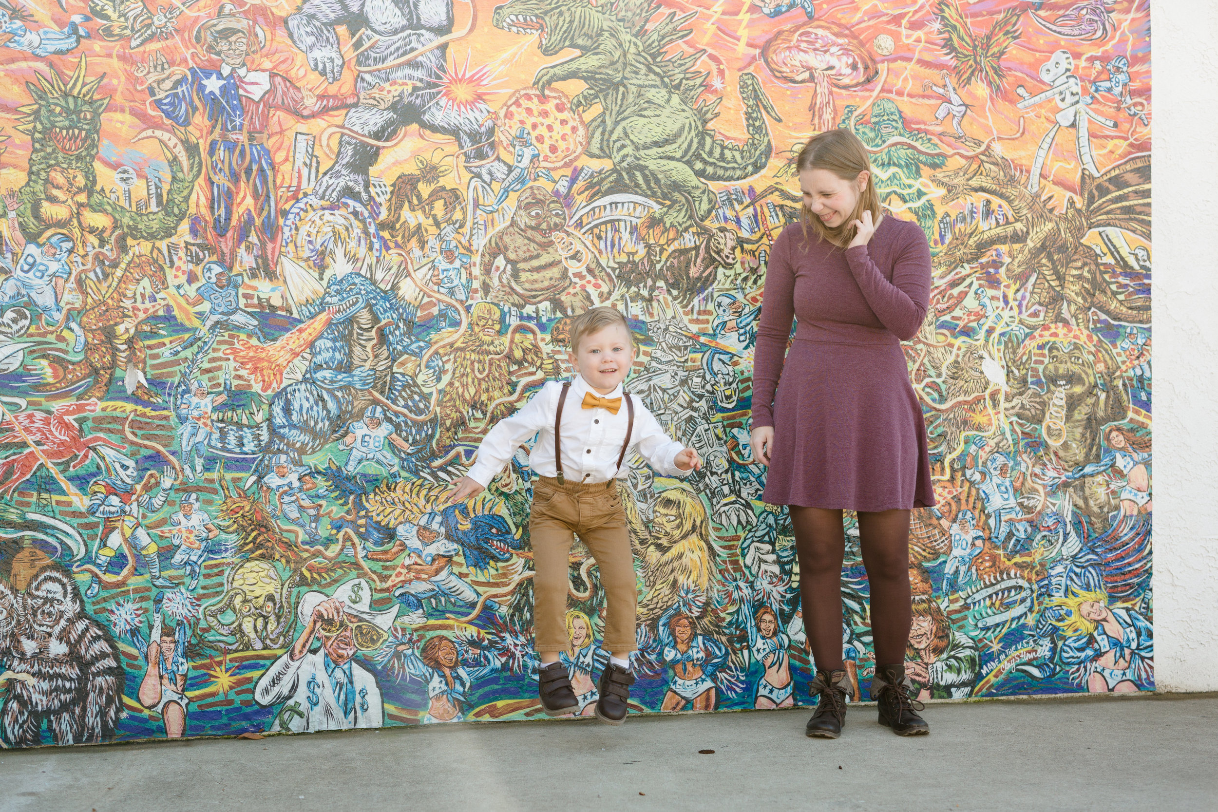
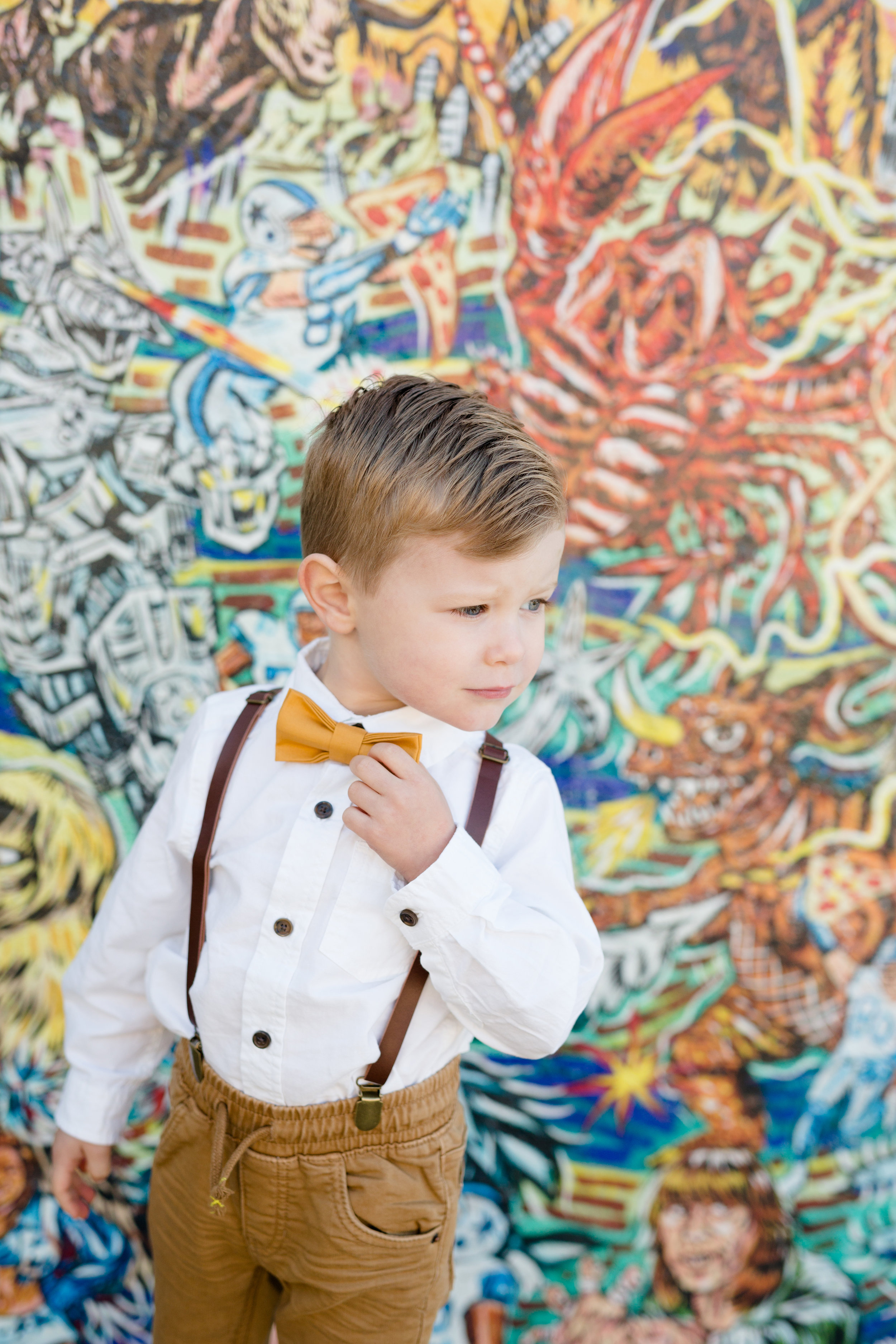
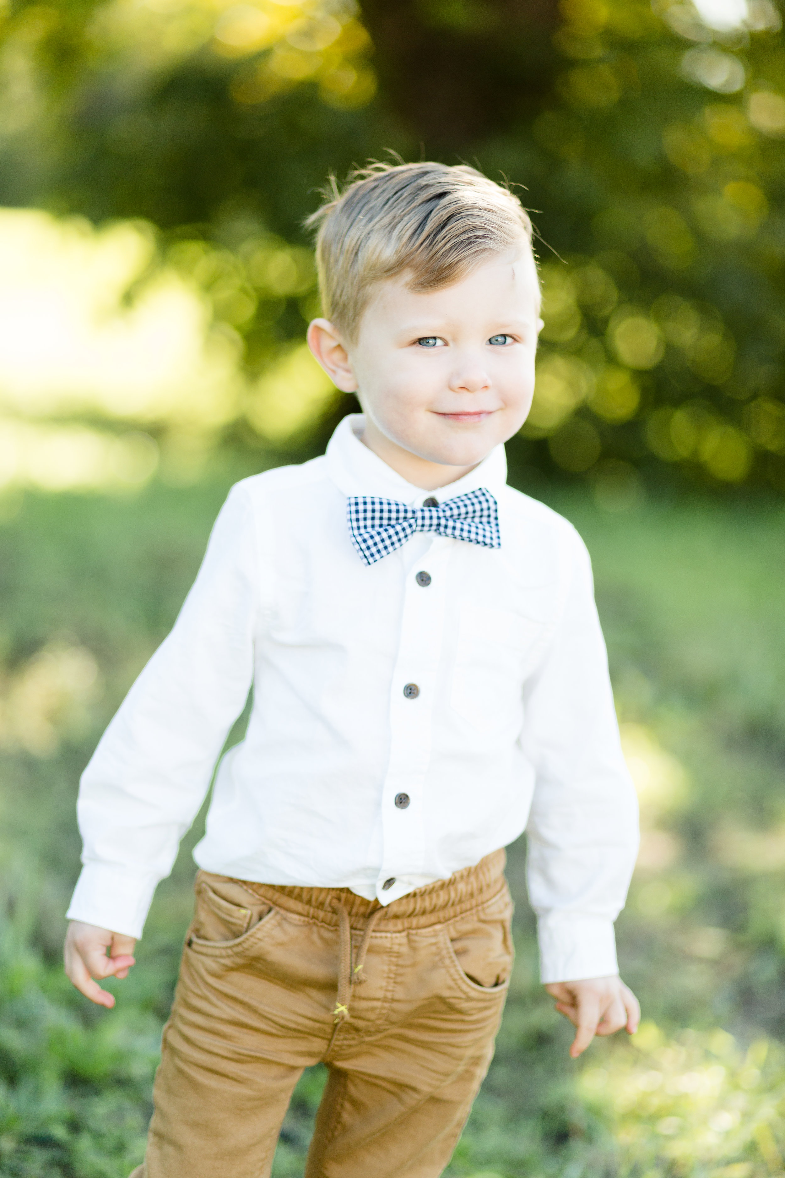
So these have to be some of my FAVORITE people to photograph! The are one of my 2019 family reps! I’ve photographed Cortney and Milo many times before and every time I rush home and look at the photos right away. I also tell her that after every time I need to get new business cards because I have a new favorite image! These images are from the 2019 family rep mini sessions! Which are great kick off to the year because I don’t offer mini sessions.
Not quite sure what my family rep program is? Read all about it here. Applications are closed for 2019 but you can still read about it. Application for 2020 (that seems so weird!) will begin last summer, early fall 2019.


